Thursday, 28 November 2013

Final Illustrations

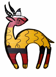
From my experimentations and developments I have created these four illustrations in response to the African Folk Tale: 

'The Story of a Hunter and his Antelope Wife.'


Explanation of the Final Outcomes:

1st image: layered Antelope Skin on a green background. Green represents vegetation and as the first scene takes place in the forest where the antelopes take off they’re skin, this represents the environment.

2nd image: the characters of the Antelope Woman and the hunter. I used a pale blue background and this means peace and harmony, portraying the meeting of these two characters leads to confiding in each other and proposed marriage. Male and females wear different dominant colour in Kente Cloth, therefore the colours in each character are based from this and also the line in the patterns are white as this means balance. This conveys the meeting of the characters.

3rd image – the Skin hanging from the roof and the pot. The background for this image is a red/orange colour because red means betrayal and this scene portrays how the hunter broke his promise and told the antelope woman’s secret to his first wife.

4th image – the woman turns back into an antelope and changes her three children too. Unlike the other images, I have outlined the antelopes in black. Black represents maturity and this represents how the young children have grown up and now turned into young male antelopes. I have used the same pattern to fill the female antelope as in the second image of the woman to show they are the same character. I used bold greens and blue colours for the other antelopes, as they are the colours that males wear. The background is a brown meaning the earth – showing how the antelopes will now leave and return to the land where they came from.   


Tuesday, 26 November 2013

Reflection on Final Outcome Ideas

Since having my tutorial I have spent the past few days experimenting for my final illustration. From talking to Chris, I have reverted to back to physically drawing as I was getting very bogged down with working on the computer. Moving away from working digitally because I prefer to work more organically. Unlike on software where you can edit and manipulate images endlessly. Also my images were getting very crowded which I do not like. I like simplicity. So I am going to stand by this and carry this into my final outcomes. Thinking about making outlines in different colours relevant to the object or character with a coloured plain background, complimenting the image. I bought some masking fluid to have a go with in my patterns. 


Here is an example of what I'm thinking for the final illustrations. The pattern I will apply in photoshop as I tried manually on paper but the result wasn't so crisp so I thought it would be best to continue this technique in Photoshop. For colours I will look at the environment of the tale and also the symbolism of colour in African culture to decide on them.

Sunday, 24 November 2013

Reflection on Development of Final Images

I just wanted to take a moment to reflect back on my progress over the last few days. When I had decided that I wanted to create my imagery using patterns and outline, influenced from my visual research into African culture I then tried to look into how I could present illustrations with a text. The original tale I took from a book and thought first can I present my illustrations with the text?


Here is a screenshot from my inDesign document. I have placement some illustrations to see how they would look when placed within the text. Using first Palantino typeface and then also trying Arial, you can see above the double spread which would be printed on A4. The typeface Palantino is often used in books which is why I chose to use it and produces a formal format, unlike the Arial typeface. As I started to place my images in the text I started to not like what it looked like immediately. I had really liked developing the style of images for the tale but when putting them within the text I really don't like how it has made them look. I tried this format as when I visited the book hive some children's book has incorporated illustrations into the text like this, but I don't think it works for my images.


Following placing the images within the text I then tried placing them next to the text on the opposite of the page which I've seen in children's books too. I think this works better but the typeface above is too light, whereas below worked better and is more legible. When I first proposed this project I said that I would create a 'collection or series of 4 to 6 images.' Why don't I just go back to what I had originally proposed? I think these layouts look better than the images actually placed in the text but as they are separate, I should just go back to producing images as a response to the tale. I have got too worried about the text that I am going off the focus of the illustrations which are the priority! 


Following my exploration of the text and image combined I started to just focus on the images and how I could use my patterns...


Here you can see how I have used the process of layering in my images, using photoshop as a tool to do this, then using InDesign to add text in my images, which are lines from the tale that I am working from. I really like the first image as I think as a composition its works well. The second two are okay and can be used as a basis to then develop. 


Cropping images into circles. Just thought I'd experiment to see how they look. Overall I think focusing on making an illustration that will stand on its own rather than beside the text is what I am going to follow through because it works more successfully. The images cropped in the circle cuts out elements in the image so do not work, but the process of layering and text in the image works well. I can now select and make exactly what I want to portray and respond to from the tale. Painting my patterns and outlines to then use photoshop to put the images together makes the illustrations quite graphic, but works well to be clear for a younger audience. I shall take my developments to my tutorial tomorrow and from my feedback, I will move this forwards.

Tuesday, 19 November 2013

Experiments in Photoshop!

Acrylic

Gouache and Ink


Ink
Gouache and Ink

Electric Tape and Pen

Oil Pastel

Acrylic
Here are my patterns in placement with character. Just like I thought, the gouache and ink works the best for what I want to portray as it can create bold, flat colour with strong lines, evident within patterns from African culture and thats what I want to make sure comes through my work. Was good to get the hold of Photoshop ready for finals and see what the other mediums look like in situe to compare!

Reflection on studio work

Experimentation with media!

Following feedback from the portfolio review it was said that I really need to experiment with some different mediums to push my ideas forward and see what works well, as I was only watercolour and acrylic. Today has been devoted to trying to find the best medium for my patterns. All the imagery I've created has been influenced from reference of African materials.

OIL PASTEL


GOUACHE & INK (left)
INK (right)

ELECTRICAL TAPE & PEN

ACRYLIC
Spending a really focused amount of time on these A3 spreads has been good for me to get into creating imagery again since I've been working on my research report for the past few days. So far in my sketchbooks I have used acrylic paint and watercolour for the line drawings but today I think I've realised some better approaches. 

First trying out Oil Pastel: before I started this I didn't think it would work for what I want but thought I would try it to see. Turns out I was right, the colours are not strong/bold enough and the lines not crisp. 

Gouache & Ink: first laying the washes of colour I didn't think the media were going to work. The colours seemed pale and patchy when they were drying. But then coming back to them and using the ink to paint over for line and shape they have turned out really well! The gouache used for the background colours work better as they create a flatter and stronger colour, whereas the ink wash can be a bit patchy which you might not be able to see in the photograph.

Electrical Tape: Using some left over tape from BA6 I thought I might as well see what that looks like with permanent marker pen over the top. The colours are bold and graphic but I think the problem is they are too bold and too graphic. If I was just presenting the patterns by themselves they could work but because I will use them to fill a character or object, the imagery is too strong to then go into a line drawing. Was good to see though.

Acrylic Paint: Used both a paint roller and brush to apply the paint to the paper. I really like the finished result as I really love the textures made from the roller, but I don't think this is what will work for this project. The African patterns I have been looking at and working from have bold, flat colours with sharp, staccato lines, and because of this I don't think this method is suitable for my current work.

Reflecting on what I have produced, I think that the gouache paint with ink line on the top has worked the most successfully. This is because I want to use my research into African art and culture to base my illustrations from, and these mediums together produce bold vibrant colours, with sharp and clear shape on top. This was a good task to do as if I had not made myself experiment with other materials I would have reverted to acrylics which I am comfortable in. When actually, exploring others has brought me to a better solution! So using these I will place behind some characters drawings I have already had, and if I am happy with the result I will go on to create patterns I want for my final images.


Monday, 18 November 2013

Plan for the Week!

Tuesday: 
  • Get on with studio work - produce patterns outside the sketchbook on A3 experimenting with different mediums (Pastel, paint...)
  • Start visualising tale through line drawings for the patterns to then be applied to 
  • Finish research report
Wednesday:
  • Go to uni and get research report draft spiral bound for hand-in
  • Buy archive box for presenting loose work in assessment at college shop
  • Play around with patterns and drawings see which are successful and which are not
Thursday:
  • From successes in imagery found on wednesday, use this to develop from to produce finals?
Friday: 
  • Start to think about placing the imagery within the text
  • Hand-in the Research Report Draft!!!

Progression with Research Report

Over the weekend and today I have focused on writing my research report draft for the deadline on friday so that its out the way and I can get on with my studio work. I had a tutorial with Catrin last week and she suggested to look down the route of how folk tales have been translated through digital means as this has direct relevance to my studio practice. I spent a day or so looking for a strong body of research for this topic but I did not find much, so I made the decision to tackle the question:

How has the digital age impacted on the illustrated book? 

Within this topic I will look into particularly children's books and story telling, therefore linking the transition of some examples tales that have been adapted to digital applications. Discussing subjects around first how the digital era has impacted on illustration and then looking into how children's story telling and illustrating narrative has transitioned into book apps. Some of the examples I will look at: Alice for the iPad, Nosy Crow's Little Red Riding Hood, Ustwo's Papercut and The Magic of Reality illustrated by Dave McKean. Even though I don't actually own an iPad, over the Christmas period I will be able to borrow my brother's to buy these apps to look at and analyse. 

Today I met up with Catrin to follow up from next week and she said I do not need to do much to it! I just need to tweak the first chapter and also add a mini conclusion on what I hope to achieve and find out by the end of the essay. Therefore, hopefully by tomorrow it will be finished :)

I am now writing the 5,000 word essay, even though originally I wanted to write 10,000 but this topic is suited to the lower word count and at least it will be finished just after Christmas and then I can focus on my other work. I have really enjoyed both researching and writing the report so far. I did find it hard at first as my research had become quite staggered because I kept receiving different feedback from different tutors. The nature of my bibliography has mostly journal articles and websites, not many books but this is because of the nature of my subject. What I'm talking about is still new. Therefore no books have been written about book apps. But using some books for a background knowledge, I can then feed this information with my found sources to debate the question I'm addressing.

Tuesday, 12 November 2013

Reflection on Studio Project so far.

I thought it would be good just to sit back and reflect on my work so far. Currently I am just starting to work on visuals responding to the tale. The problem I'm having at the moment is my research far outweighs my practical work at this point. This is what I have tended to do in other previous projects and research for too long then don't leave myself enough time to explore practically. But I still have time, I just need to address this now to get it right for the big unit next year! I have started to look into simple character design and image-making, using photoshop to manipulate and compose illustrations. I'm playing safe at the moment, getting stressed that I don't have a lot of time and not wanting to push myself too much and not get out of my comfort zone which I need to change. My review today went well and I got some good feedback. I just need to really pick up the pace with my image making and work outside the sketchbook! I want all my imagery to be based or influenced by African culture: the patterns based around patterns used in clothing etc. and character from what I have seen in sculptures. Bold lines, simple features and I want to use these elements in my character design. My illustrations will need to be presented with the text somehow so I need to start looking into this particularly. What has worked so far is the layering of character over pattern. Just need to look and develop this further and will hopefully come across some good results! So just get drawing!!! :D

Portfolio Review with Chris


Feedback:


  • Look into other colours for backgrounds
  • Try other techniques/materials?.. printing, paints...
  • Line drawings in brown work well rather than a harsh black?
  • Get bolder and brighter with colours!
  • Look at specific colour pallette
  • Develop ideas as are quite literal
  • Take your time with drawing
  • Look into African costumes: different fabrics for different countries...
  • Could you look into silhouettes again but fill the shape with pattern? or block colour other than black - no outline
  • When making images - consider placement... make patterns considering where the character will be placed, so not too busy
  • Patterns = could you make a pattern with characters and colours? Layering
  • Type up text of narrative and use to start thinking about placement and layout with images.
Overall feedback was good just need to crack on!! Got some good ideas to follow and respond to now and have good reference material to now work from. Will take some of these images to Pop-Up show on friday to get other peer feedback.

Children's book illustration examples from the Book Hive

I decided to take a visit to the Book Hive in Norwich to take a look at what children's illustrated books there are on the market at the moment. To look at how they have looked imagery, its placement and relationship with text...


'Little Red Riding Hood' by Marjolaine Leray.
This was a nice little book, with 'sketchy' illustrations of the tale contains very little text and lots of white space. Using a colour palette of black and red, relies on the visuals rather than the text to tell tell the narrative. 
'Walk the Way' by Lotto Neimenen.
 This book stood out as it is very graphic compared to some of the illustrations in story books. Bright colours and considered layout for where text is placed.

Next book found the imagery very interesting! Greens and greys creating a different world.


Text on one page, illustration on next...

Pedro Serapicos
The handwritten type in this book relates to the 'style' of the illustrations in this book. Not formal layout put text space considered within image.


Printing!! Interesting layout and involvement with text within the image.

'A River of Stories' by Joan Pienkowski
This book is for an older child or teen. Quite a lot of text with a few illustrations throughout. Bold, colour backgrounds with silhouettes on top. Similar to what I have been looking at within my work and also in Tales of the Night animation. 


Book that I happened to see on a person's desk and though that it would be great for both my studio and research report projects. So I have requested an inter-loan for it from the University library!

Was good to go to the Book Hive and just have a browse through the children's section as their collection contains more artistic books rather than just traditional young children book art, which tend to be different into the way they've been drawn and materials not being so soft. I wanted to also look at the layouts and relationship of text and image in the books thinking about what I could do with my own work. Looking at how the text has been arranged in the image itself as well as beside it.


Sunday, 10 November 2013

Experimenting with image & layering


Couple of experiments following layering techniques I started to explore the other day, but used characters from a sketchbook of drawings from reference. Looking into again the black line over pattern. Thinking about how I could address these to my actual illustrations for the tale. Background pattern doesn't have to literally translate the place but just have an influence - on colour etc. Then place line drawings of character rather than silhouettes, as silhouettes doesn't portray much of character. Think these little experiments have been successful - must lower the opacity to a certain level otherwise the image will get too busy, but overall works well.

Plan for this week:


Monday:

  • Tutorial with Caitrin 1.10pm (bring research report stuff)
  • Visit the book hive to look at Children's book illustration
  • Visualise tale - character building in small sketchbook

Tuesday:

  • Keep on working visuals
  • For review: bring A4 portfolio with all work so far! Project proposal and print outs?
  • Portfolio Review with Chris 1.30-4.30pm

Wednesday:

  • Volunteering at Catton Grove Primary School: Year 1 (Percy the Park Keeper) art project

Thursday:

  • Volunteering at Catton Grove Primary School: Year 1 (Percy the Park Keeper) art project

Friday:

  • Lecture?
  • Keep working on visuals and report 


Friday, 8 November 2013

Experimentation with layering

Now that I am starting to look at how to visually represent the tale, I began looking at the characters of the Antelope. The book of patterns I filled made me start to think how I could incorporate them into the illustrations.... could I use them as a background? Focusing the colours to what the environment where the action is taking place. Therefore, looking the figures in form of lines or silhouettes.


Using two backgrounds consisting colours of the forest, I played around with opacity in Photoshop then over-laid the animals over the top. Between the silhouettes and line I think I prefer the line, this is because I think the quality of the line portrays more of a 'character,' whereas the silhouettes are a block colour. Also if I do this the research I have done into African figures I cannot apply to the human characters. I think the first image with the outline on top of the full patterned background as the line drawing of the antelope really stands out compared to the other background where it is too busy. Look into this method further with other imagery as it has worked successfully, but use different colours to create a new environment and explore other characters in the story.

Project so far (continued)...

Last week and this week, to continue to make visual research for myself another way than going to the Museum/Gallery I filled two sketchbooks of African figures/sculptures and one of African patterns I found either through the books I have borrowed from the Millennium Library or on the internet.


Here is a few images of the patterns I started to explore with acrylic paint. I notices that the bold primary colours as well as brown, green and black were commonly featured on garments, cloth and artwork. Combining specific colours with line and shape. By starting to refer to first the references I then started to create my own by the end. Could I use these in my illustrations of the tale? As a background for instance and use silhouettes over the top like the animation 'Tales of the Night'?


A selection of watercolour studies from sketchbook, great tool to start thinking about character development!! Think about how these could develop into the characters of the tale!! In maybe simple outline over patterns?