Friday 28 February 2014

Platforms Workshop

CONSTRUCTION SCHOOL

(School & Theatre)
Overall Ideas:
  • Sketching with objects
  • Shapes
  • Set of rules/guidelines
  • Stimulus
  • Cubes // Flat
Documentation of Wednesday's meeting:


This wednesday we all brought in a found objects to see if we could find a link or come up with a concept for the workshop we are planning to deliver. The problem with this was all our objects seemed too random to create an idea or stimulus to base a workshop from. So we decided to brainstorm other ideas. Getting some mount-board we thought we could create shapes to be placed and people to use them to 'draw with objects.' Maybe further developing this using wooden cubes. Next week we will discuss these initial ideas further to trial run this coming Friday.

Thursday 27 February 2014

Reflection:

At this point I had hoped that I would have completed the first project but this has not gone to plan. It took me longer than I thought to really it get into the project and establish my imagery. After we handed the research report I first became a bit at a loss. I spent a lot of focus time on my essay and really enjoyed writing it. To then go back to the practical work really since BA7 I was first nervous and not confident. I did work but not to my full strength. Over the last two weeks though, I have re-established my image-making and getting back into the full flow and potential of my practice. 

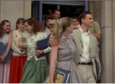
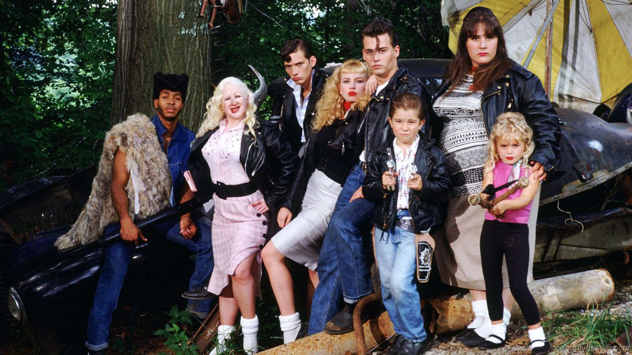
Whilst looking into the The Outsider for me, what really stood out to me was the reference of the cars to convey the divide in society between the upper and lower middle class - the Socs and the Greasers. From looking at drawing the particular cars mentioned in the prose I decided to take my imagery further into print making. I have tried different methods of print in the past, especially in the first year, but since then I have stuck to mediums that I love to use like paints and inks and have experimented with it forwards. Therefore this was a good point to try something new and see what results I could create! Using lino, I simply cut into a piece just bigger than A5 and printed on paper simply at home rather than on a printing press. I felt that I created some really exciting visuals that I could push further to maybe incorporate into the final book cover design.

Taking these results into my review on Tuesday with a few peers and Glyn, they liked the results. I had also tried some mono-printing and Glyn said that he liked the line work in those too so could I incorporate both mediums together? In my print design, I repeated the Soc's car but only showed one of the Greaser's car to isolate it from the others. Suggested to make this idea of exclusion stronger was to use colour to present the isolation or introduce line work over the top of the lino prints to show the difference and division in the cars.

This week I am in the process of investigating line imagery with print and also printing on different papers. I personally so far prefer using newsprint paper. This is because I like that it is off-white and also has a flat texture, so when its printed on the colour comes out flat. Unlike on some other papers where you can see its textures or grain. Also, the fact that I'm printing on such cheap, common paper could this reflect upon the class system portrayed within the narrative upon the upper class against the lower??

Even though I am slightly behind on my schedule at the moment, my work is picking up. So I aim to complete this project within the next few days so I can then move on to the next as I'm really looking forwards to pushing and develop my work from unit BA7.

Wednesday 26 February 2014

Final Stage of the UEA Collaboration Project

Now that me and my partner have completed our text and image responses, I looked into producing a double page spread incorporating our work to present at the exhibition Friday. Thinking about the workshop I had a few weeks ago: 'Hardware' where we approached a double page spread in interesting ways, I decided to take further some of my ideas I established in the workshop. As the text talked about confusion, I cut up the text and placed it fragmented on the page to convey this. This time,  I cut up words and phrases from all four texts Georgie sent me that I responded to in particular to form the base composition of the spread to the then place the images around: 


The next step was to play around with the placements of visuals...


(1)

(2)

(3)

(4)

Experimenting with image opacity, placement and scale I came up wit the 4 options above. I have decided to present: (1) as I feel that the placement of the images work well curving round the text. Lowering the opacity of the images in version (4) works well behind the text but doesn't show the vibrancy of each image, and the other two are not as strong compositional.

For the exhibition Friday, we can include 9 landscape A4 spreads documenting the development of the project in a vertical line. A few examples of these spreads are below. I have included Georgie's prose and poems she sent me with either my final images or development work.


I will document the final show friday to show the collaboration project as a whole. It will also be the first time I will meet Georgie who I have worked with from UEA. It will be good to meet her in person and discuss our project and how we think it has gone. Overall, I think this project has been successful and a bit of fun separate to my BA8 projects, demonstrating the relationship of how an illustrator and writer can work together. As I have edited the writer's text down whereas in the work place it can commonly be the other way round and leave the illustrator to have no say on the final outcome/product. Unlike within this project, I have rendered the final double spreads.


Monday 24 February 2014

Development of the Collaboration Project

3rd Visual Response:

Georgie sent me over a piece she had written as well as 2 poems that she had previously completed but sent them over as some of the content related to the project we've worked on so far. Instead of focusing on what prose, I decided to pull words to work from in a more abstract way than before, to see what exciting visuals I could create. The words I responded I to were:

- Swirls
- Veins
- Imperfections
- Curls
- Patterns
- Distorting
- Shavings
- Dream
- Spiral
- Falling
- Lost

Thinking about using colour and line to illustrate these words, the images below is how responded using liquid ink on paper to then scan them in photoshop and play with composition.


Final 3rd Image:
For the finalised image for the project I incorporated two drawings to produce one playful and colourful composition. Using some of the colours from the palette used in the first image, I wanted to convey to the audience an abstract representation of a dream-like state of confusion and the feeling of being lost within the distortion of one's mind.

Saturday 22 February 2014

Study Trip to Pitt Rivers, Oxford.


Wednesday 19/02/2014:

This week I managed to get the chance to visit the Pitt Rivers Museum which I have wanted to go and see for a few weeks now, as recommended to me by my tutors and peers. Even though I have not started the project relevant for this Museum  yet, I will be soon and it was great trip to make me start thinking about it. 

The Pitt Rivers was one of the best museums I have ever been to! There was so much visual material and objects to see and reference, which I recorded through photography and drawing.


Working from patterns, pots, masks and figures I visually observed using my colour pencil and ink in my sketchbook. I got some great primary reference to work from and managed to establish a strong lineal approach to drawing in my work which I will develop on when starting this next project.

Monday 17 February 2014

Films: The Outsiders and Cry Baby.

Cry Baby

Recommended in one my reviews was to watch Cry Baby, as it relates to the book I am illustrating the cover for at the moment. The Outsiders talks about the divide between the social classes through the two gangs: the Socs (Socials) and the Greasers. Similarly portrayed in Cry Baby through the two gangs; the Squares and the Creepers. Both the Socs and the Squares are part of upper class society who wear light colours - ofter checkered shirts, pale trousers and cardigans. Whereas the Greasers and Creepers are the lower middle class of society portrayed wearing blue jeans, leather jackets and greased back hair. Even though Cry Baby is comedic/musical interpretation of a divide and the Outsiders translates the book seriously, they both contain similar motifs and symbols to convey the division. Mainly through CARS. This is what I am focusing on for the cover, illustrating the conflict and un-balanced medium within society. Even though Cry Baby wasn't a particularly good film, it gave me another perspective into the perspective of the social gangs in 1960s America. The Outsiders film was good for me to view to visually take in the story as well as reading the book, seeing how the film director translated the prose into moving image and how the main themes in the book were conveyed to the audience.

Cry Baby film still: The "Squares"
The "Creepers"
Film Still from 'Cry Baby'
The Outsiders film still: The "Greasers"
The "Socials"

Collaboration Project continued...

Since Georgie emailed me her prose responding to my image, I decided to work from the three paragraphs at the start of her writing. Using colours that portrayed the darkness and confusion evoked through the prose.


The group workshop last friday involved responding to the text literally and quickly using only two colours. Then working on one image repetitively to create new compositions. This was a good exercise to make you think and work quickly and using the restriction of the limit of two colours to see what you can come up with.


Sunday 16 February 2014

Printing! Printing! Printing!

As another method in experimenting with imagery ideas for the book cover of The Outsiders I decided to look into mono-printing and lino-cuts! I haven't practiced this technique since the first year of my degree so thought that this would be a good thing to go back to to see if I can get any good results. First I started with mono-printing to warm up and then started the lino. I have been looking into the symbol of the cars in the book as well as experimenting with the finger print to convey the violence and crime within the narrative. Below shows a collection of prints that I produced and it was a really good way of producing images quickly. I got some good feedback from fellow peers within the studio and also was suggested to take the lino into the printing room and use a proper printing press on better quality paper. I think I will get some more lino, experiment further and then go into the printing room to see what results I can get!


Wednesday 12 February 2014

London Visits: 24.01.2014 / 11.02.2014

24th Jan:

I visited some exhibitions at the the British Library, the Wellcome Collection and the V&A. The exhibition at the British Library was particularly interesting. Picture This: Children's Illustrated Classics, This featured illustrated editions over the years and also presented how illustration can be applied into an exhibition interestingly.


Books were displayed in cabinets next to single illustrations and also printed on a large scale on the surrounding walls. This gave me food for thought when thinking about the final degree show regarding how small illustrations can be presented to an audience out of its original context.


Here are a few photos from the Wellcome Collection that I found particularly interesting. These pieces were textual and 

11th Feb:

This tuesday I visited the Museum of Childhood, the Nobrow book shop and the Lighthouse studios. 


Monday 10 February 2014

'The Little Yellow Leaf'

Visual Research


I came across this illustrated children's book and really loved the compositions of text and image and how they work together. Carin Berger's illustrations composed of collage media and flat imagery presents an interesting and different way of illustrating children's book. I am going to definitely look into buying one of her books to get inspiration from!!

Saturday 8 February 2014

UEA Collaboration Project

As another part to BA8 we have been given a task to collaborate with a first year studying Creative Writing at UEA. I have been partnered with a student named Georgie Currie and the brief entails me initialling sending her one of my illustrations to respond to, and then working backwards and forwards in this way till we end up with two illustrations and two pieces of text. This was the image I sent her: 


This was an illustration I produced for a project I did in the second year for BA5 and thought I'd send this to Georgie as it shows a great portrayal of character and I really enjoyed drawing in this style. 

Georgie responded to my image with a well written piece of creative prose filling an A4 page. But what stood out to me was the first three paragraphs that she wrote:

I am flung into the darkness with the others. The impact of the drop ignites a spark in the lower of my back, causing a vicious heat to slowly twist up my spine, devouring and stinging each nerve like a swarm of hornets, until an agonising fever shoots along my temples and explodes behind my eyes. Crying out, I am certain that I will never see again.                                             
Around me I am overwhelmed by the suffocating stuffiness of second-hand cloth, of sweat that clings on strangers’ unwashed, uncared for clothing. A stench so profane and intense, it irrationally drives one stir-crazy and scrub themselves clean with soap and disinfectant until skin cracks and weeps wine. The weight of the outstretched bodies that tumble onto me stamps heaviness on my chest, making it hard to breath. I wheeze, cough, choke. In utter horror, I realise that they are slowly crushing me alive.                                                        
        But then there is stillness and the weight, although still unbearable, does not increase. I am left paralysed in a purgatory of confusion, a nightmare of the rat caught in a trap; it lacks the power of escape but is confined with the knowledge of its fate. All it can do is wait.

I thought the atmosphere created through these few paragraphs really encapsulates the reader. Leaving them questioning who the character of the narrative is and what is happening to them... 

Friday's Workshop (7th February): 

This workshop was set to make us think about a double spread of image and text can form and mean. As this will be the final outcome of the collaboration project, the relationship of the page and content is significant to conveying the narrative of the prose and image. Thinking about other ways than literally just placing an image next to an image on either side of the spread, the workshop made us think about a page, architecturally as an object and space as well as placement of the text within the space.


Here are the 7 spreads I ended up producing. I had to think playfully and ended up cutting into the page and placing the text into a way that extends and reflects the meaning of the narrative. The sentences I chose to use talked about confusion, a maze and waiting. This really helped me to look at double page spread in an open and interesting way. Developing ideas how the final outcome could be made and editing the text to get its full potential. Now the next step for me is to respond to Georgie's prose visually.